
1Password
A random note on UI language

Yesterday I got an email from 1Password telling me that starting this year, my annual bill is increasing by about 20%.
And I’m not mad about it.
This was the first price hike I’ve gotten from 1Password, a service I have pretty much zero complaints about in the 7 years I’ve been a customer. Meanwhile, every other tech I paid for have increased their prices without batting an eye and just expect us to eat it each time.
The email from 1Password prompted me to log into my account on the web. And I made two discoveries:
That I’d been a customer for 7 years.
That my late mom was still a member of my family account. Kinda.
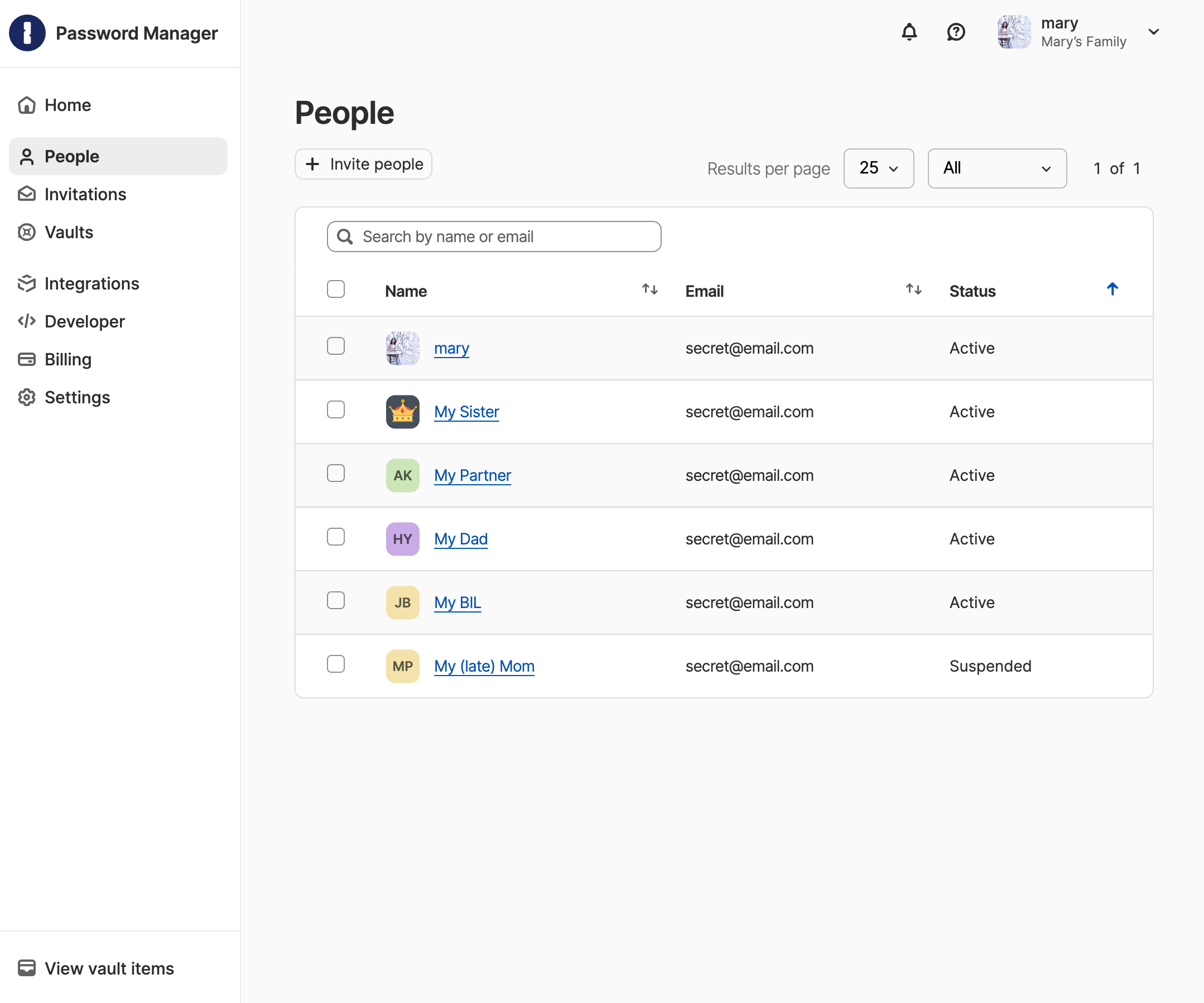
The thing is, I still haven’t had the heart to “delete” my mom’s user seat, nearly 5 years after I “suspended” it.
I still vaguely remember clicking on the “suspend” button back then.
Truly, I can’t even call this a real “user pain.” Compared to everything else that was making me despise being alive and awake, it was certainly nothing at all. It was more like an awkwardness that had just a touch of blue. A minor ache that was barely noticeable.
I remember thinking, I’m suspending my mom? How odd.
The thing is, even minor aches add up.
Hey 1Password, please consider an “archive” option. Because little bits of thoughtfulness add up, too. Even if it is just a frontend label with absolutely zero differences in functionality vs. “suspend”, language absolutely matters.